
During the early stages of the pandemic in March 2020, there was one game that really helped me get through the initial weeks of settling into quarantine life. That game was Animal Crossing: New Horizons (ACNH). I've been a huge fan of the Animal Crossing series since I was a teenager, playing Animal Crossing: New Leaf (ACNL) on my 3DS. At the time of writing, I have logged 575 hours into ACNH, and around 200 hours in ACNL.
For those who don't know, Animal Crossing is an open-ended life simulation game developed and published by Nintendo. There is no real set objective. Instead, players spend most of their time befriending the animal inhabitants (also known as villagers) of your town, and partaking in various tasks such as gardening, fishing, fossil hunting, and bug catching.
The vibrant villagers and relaxing pace of the gameplay provides a very charming experience. The game uses the console's internal clock and calendar to allow players to interact with their town in real-time. I actually teared up a little when my villagers threw a surprise birthday party for me, complete with confetti and cake.
The newest installment of the game series, New Horizons, takes place on a deserted island. As the player, you get to work on developing and decorating the island to your heart's content, while inviting animal villagers to inhabit the island with you.
April 2021
Game UI/UX design
My ACNH character alongside Kidd the goat. Aren't we just adorable?
I would consider the decorating and customizing aspect my favorite part of the game. The customization options of the game are amazing, and I have seen some players create some truly amazing and creative islands! With that being said, after countless hours customizing my island, I have found myself frustrated with certain elements of the game's UI/UX.
In this case study, I will focus on critiquing the UI/UX of the game's island designer feature, and I will suggest alternative designs as a possible solution.
I will preface this by acknowledging that I am writing this case study from an outsider's perspective. I have no idea what kind of restrictions the design and development team faced at Nintendo. The critique and alternate design suggestions I present are based off of my design intuition and personal experience as a player, as well as the qualitative experiences of other players, based on what from what I have seen/heard.
I recognize that a lot of the UI/UX choices were deliberate decisions made by Nintendo. The game was designed in a way to be easily accessible to players of all ages, whether they have gaming experience or not. The game is also designed to be slow, relaxing, and it is meant to simulate the pace of real-life. I wholeheartedly respect that. I will admit that taking time out of my day to water my virtual flower beds a little bit at a time was oddly satisfying, especially when I'm usually playing faster paced shooters or role-playing games (RPGs).
However, in my opinion, I believe that good UX should also take into account flexibility, and efficiency of use. As one of the ten usability heuristics defined by Jakob Nielson, he writes,
"Accelerators — unseen by the novice user — may often speed up the interaction for the expert user such that the system can cater to both inexperienced and experienced users. Allow users to tailor frequent actions."
For avid, experienced players such as me, there are certain areas of the game that just feel clunky, slow, and burdensome. I believe for actions that players will be repeating over and over again, there should be a shortcut, or a more efficient way to perform the action.
Another major gripe I have with the UX of the island designer is the lack of error prevention measures. In the game, the island and everything on it is built on top of a grid system. However, there is a lack of any indication as to what the grid looks like, leaving players to guess and make rough estimates while designing their island. All this guess work results in a lot of player mistakes, which can be frustrating and time-consuming to fix.
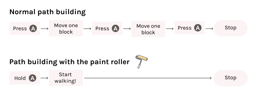
The process of path building in ACNH is extremely tedious, requiring the player to fill in the path one block at a time. This is problematic not only in that it can annoy players, but it also sacrifices accessibility, for players who may find repeated button mashing a barrier to enjoying the game.
Laying down the path one block at the time is handy in situations where you may want a complicated, intricate design. However, for situations where you would like to just pave a street in a straight line, it is just plain inefficient.
I think there could be an option for players to speed up this process, while still maintaining the match between the game and the real world.
ACNH path building in all its slow glory.
In keeping with the relaxed life simulator spirit of the game, I don't believe that just changing the whole path creation system is the answer. Instead, I propose providing the option for more experienced players to purchase an upgrade, via in-game currency (bells or Nook Miles) to allow for a more efficient process.
The whole idea of spending currency in exchange for quality-of-life upgrades in ACNH isn't new. When first starting the game, the player is provided a couple different tools that can be used for various tasks around the island. Switching between tools can be a bit of a pain, as players either have to press 'X' every time they want to switch the tool they're using or cycle through them using the left Joy-Con D-Pad.
As the player progresses through the game, they are eventually given the option to purchase a tool ring using Nook Miles. The tool ring allows for players to quickly open up a menu to select their desired tool.
Slowly and progressively revealing different mechanics and shortcuts as the player spends time learning the ropes of the game is where I think ACNH's UX really shines.
When players are laying down a path currently in ACNH, they hold a little paint palette and swipe at the ground to effectively 'paint' the selected area with the path. To play off of this idea, I propose a paint roller tool, which can be purchased as an upgrade with Nook Miles. The paint roller thematically works within the ACNH world, and it is also a subtle nod to the splat roller weapon in Nintendo's other popular game, Splatoon.
The paint roller would work by allowing players to hold down the 'A' button and moving in a straight line, as opposed to moving to a square, mashing 'A', and then moving to the next square.
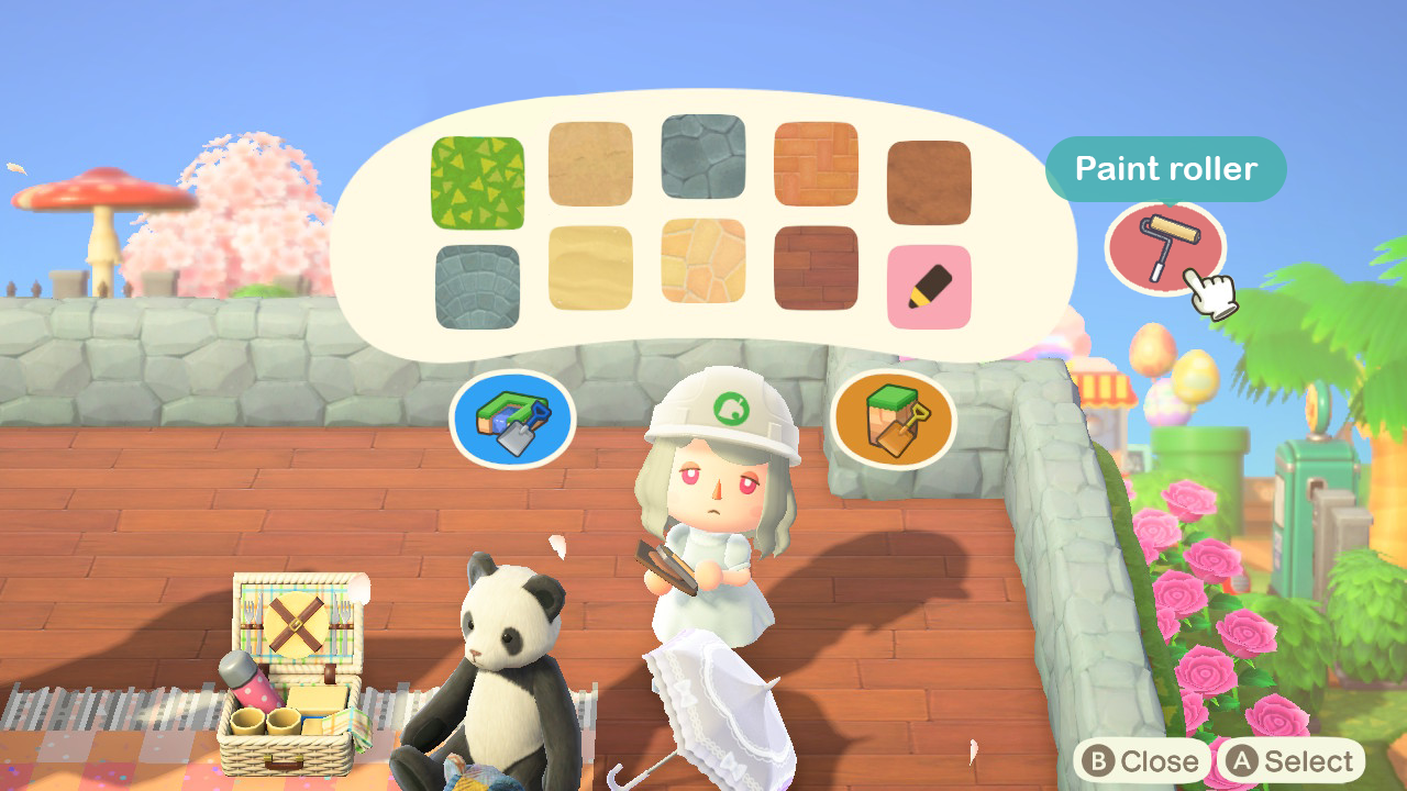
Mockup of the paint roller UI + icon:
Whether the player is terraforming (building or destroying cliffs and rivers) or path building, ACNH's UI does not offer any signifier as to which area tile they are currently selecting. With the lack of visual aid, players don't know which tile they are building on, until they have already built on it. This leads to a lot of unwanted mistakes being made by the player, and results in a stressful and annoying user experience.
Although the island and all the objects on the island are built on a grid system, the players can move freely, without being restricted to the grid. As a result, if a player is standing in between two tiles, it can be hard to predict which tile is about to be modified by the player.
This is shown in the video clip below. My character is standing in between two tiles, about to build a cliff. Can you guess which tile is going to be modified?
Players may not always require a visual aid, if they are trying to terraform a big, wide area. However, in situations where players would like a bit more accuracy and control, the UI should allow for better visual aid.
For my solution, I propose adding the option to hold down the 'A' button, and a box and indicator will signify which tile is being selected. The player can then move their joystick to choose which tile they would like to modify, and release 'A' to select.
Mockup of the visual indicator UI:
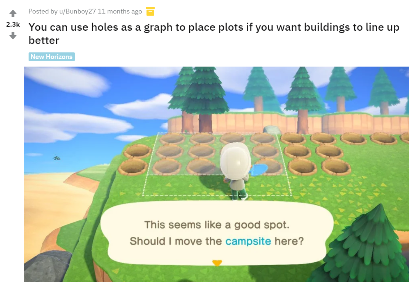
As I mentioned previously, everything on the island is built on an invisible grid. The pesky invisible grid again proves to be a nuisance, if a player wants to ensure that their buildings and paths are lining up properly. Moving buildings is no small task in ACNH, as it requires a hefty sum of bells, as well as a waiting period of one day. This means that it's vital for players to ensure that everything lines up prior to moving a building. The inability to view the grid results in many players having to turn to "hacks" or workarounds.
An example of a workaround can be seen in the Reddit post below. In the screenshot, a player digs a series of holes in the ground to use as a unit of measurement for the invisible grid tiles.
I realize that ACNH is not a game that is focused on building. At it's core, Animal Crossing is really an open-ended life simulation, and some players may not really care too much about lining all their buildings up pixel perfectly. Perhaps the ability to toggle the island's underlying grid system on/off would somehow take away a sense of realism from the game. Maybe adding too much structure to the game would take away from the relaxing and natural tone that they were trying to go for.
However, as we can see from the community of ACNH players online, many players want the ability to measure spacing on the island. As the newest game in the Animal Crossing series, ACNH introduced a ton of new customization mechanics. It only makes sense that some players would want to really take the time and customize their island to the best of their ability.
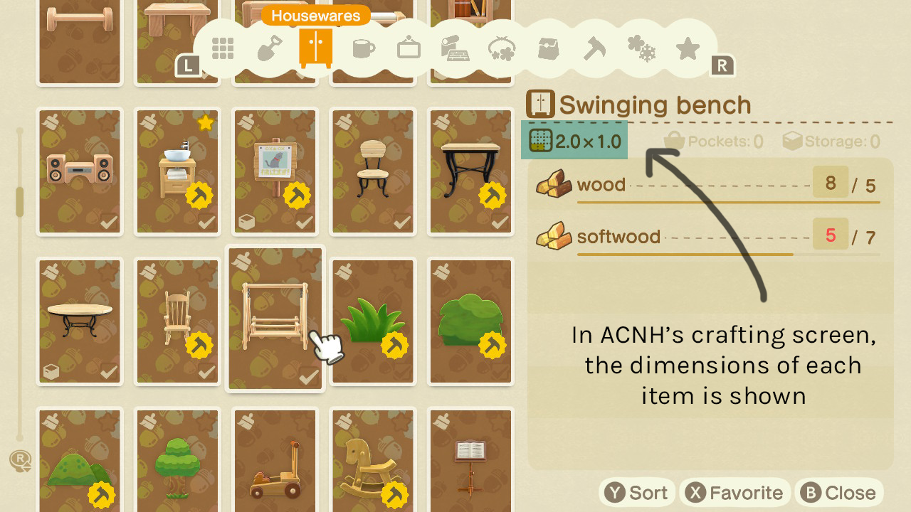
From the screenshot below, we can see that when crafting an item in the game, the UI already shows the dimensions of the object, by visually colouring in the number of tiles the object takes up. However, without an easy way to view the grid on your island, it can sometimes be hard to imagine how an item will fit.
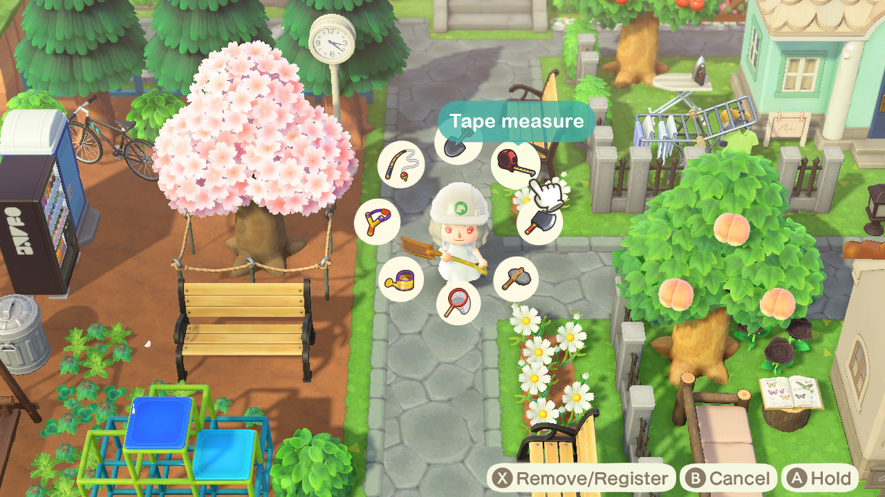
While the ability to toggle on/off the grid is probably the easiest solution, I wanted to dig a little deeper and think about a more minimalist solution to this problem that would still feel "natural" to the game. Thus I came up with the idea of a tape measure tool. Similar to the paint roller tool, the tape measure tool could be introduced later on in the game, and purchased via Nook Miles.
UI mockup of the tape measure tool in the tool ring:
The tape measure tool would work by allowing players to hold down 'A' with the tool selected. The player can then walk over the tiles that they would like to measure, and the screen would show the outlines of each tile. The player can then let go of the 'A' button, and the highlighted tile outlines would remain, in case the player would like to keep them as a visual guide while they are designing their island. To hide the outlines, the player would have to walk over any one of the highlighted blocks, and press 'B'.
UI mockup of the tape measure tool in action:
Again, I am presenting these speculative design solutions as a design exercise. Asides from working on a few personal game projects, I do not have experience working professionally as a UI/UX designer in games. Without extensive play testing, it is hard to say if my design solutions would actually improve the player's experience.
However, I found the design exercise really fun and rewarding, and I would like to continue challenging myself to not only critique the UI/UX in games, but also to think about different design solutions to fix the UI/UX issues I come across.
← Previous Project
UBC CPD
Next Project →
Illustration Gallery