
The UBC CPD eLearning site is home to accredited online learning courses for practicing physicians in Canada.
The site was first launched back in 2014, using the learning management system (LMS) Moodle. Since then the site has grown, and at the time of writing, is home to 59 open courses!
We found that our eLearning site was starting to experience some growing pains, and our site was no longer able to provide a great user experience to our learners.
See the live site here.
April 2020 - June 2021
UI/UX design, web design, front-end web development
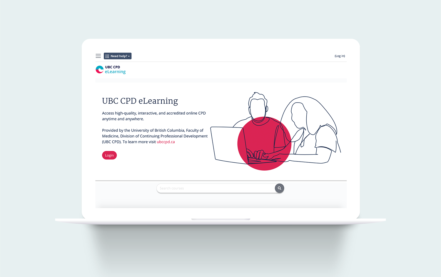
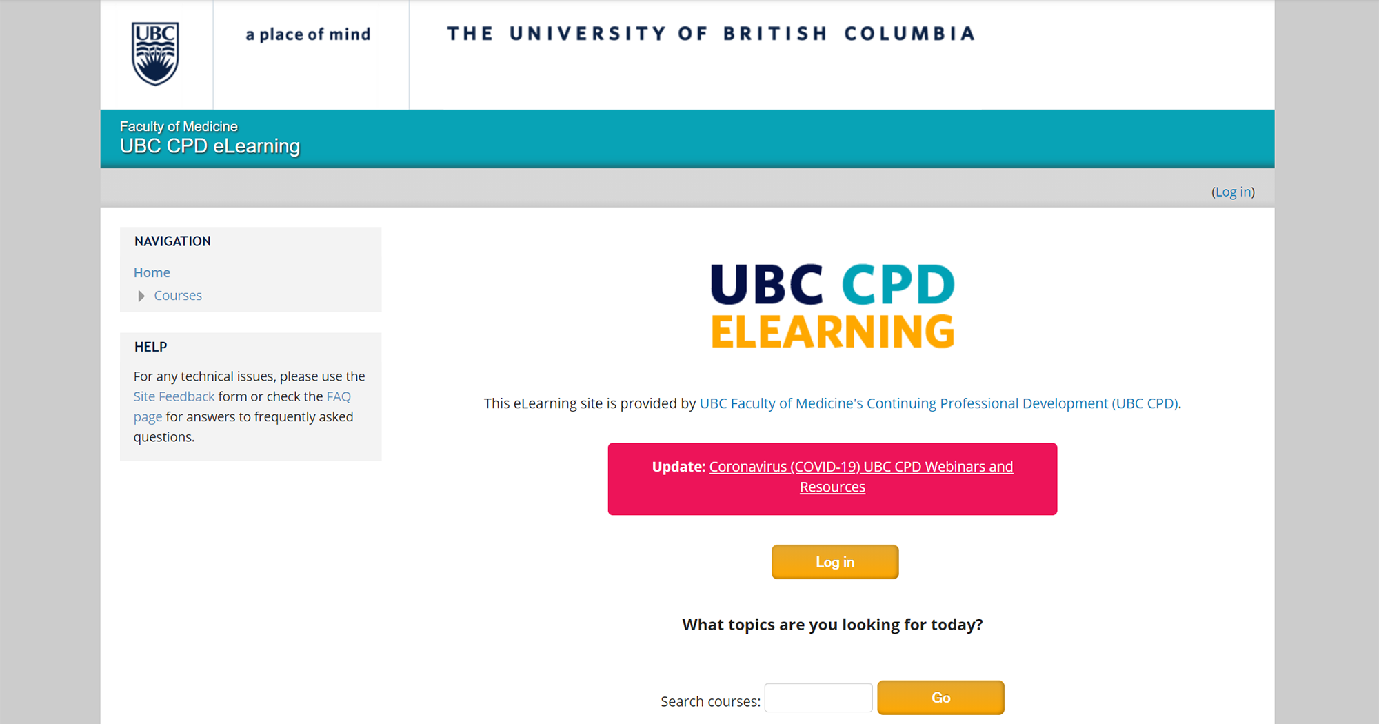
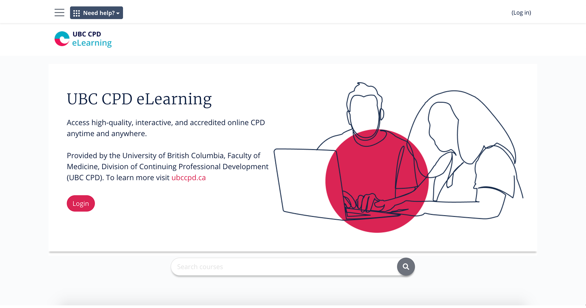
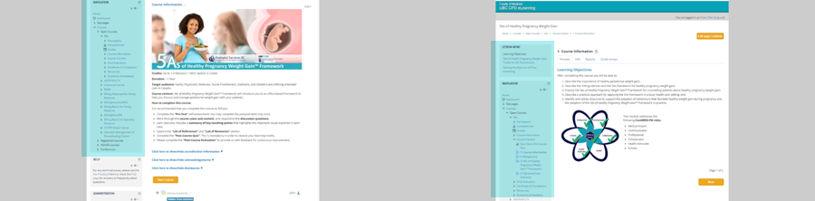
Use the slider below to compare the website's splash page before and after the redesign!
In 2020, UBC CPD underwent a major branding refresh. Our Creative Team was tasked with redesigning our eLearning site, updating the look and feel to match the division's new creative direction, and improving the user experience.
I was responsible for leading this redesign. My main tasks included conducting research into the user pain points, conducting user testing sessions, and designing/implementing the front-end site styling.
Due to the nature of our LMS, we had to design within many restrictions. A large portion of the LMS is hardcoded from the back-end, so we had to come up with design solutions that worked within the existing framework. Our Creative team is small and consisted of only designers, so we did not have ready access to developers.
Upon upgrading our LMS, we were able to update our site's theme. The new pre-built theme was not able to meet our learner's needs entirely, and there was still a lot of work that needed to be done! We decided to use the new theme as a base for us to iterate and improve on.
To identify the areas of the original site that needed improvement, I first looked through feedback from our learners on our existing design. This feedback was collected through post-course questionnaires, our site feedback form, and our support inbox. From this feedback, I made note of the most common complaints.
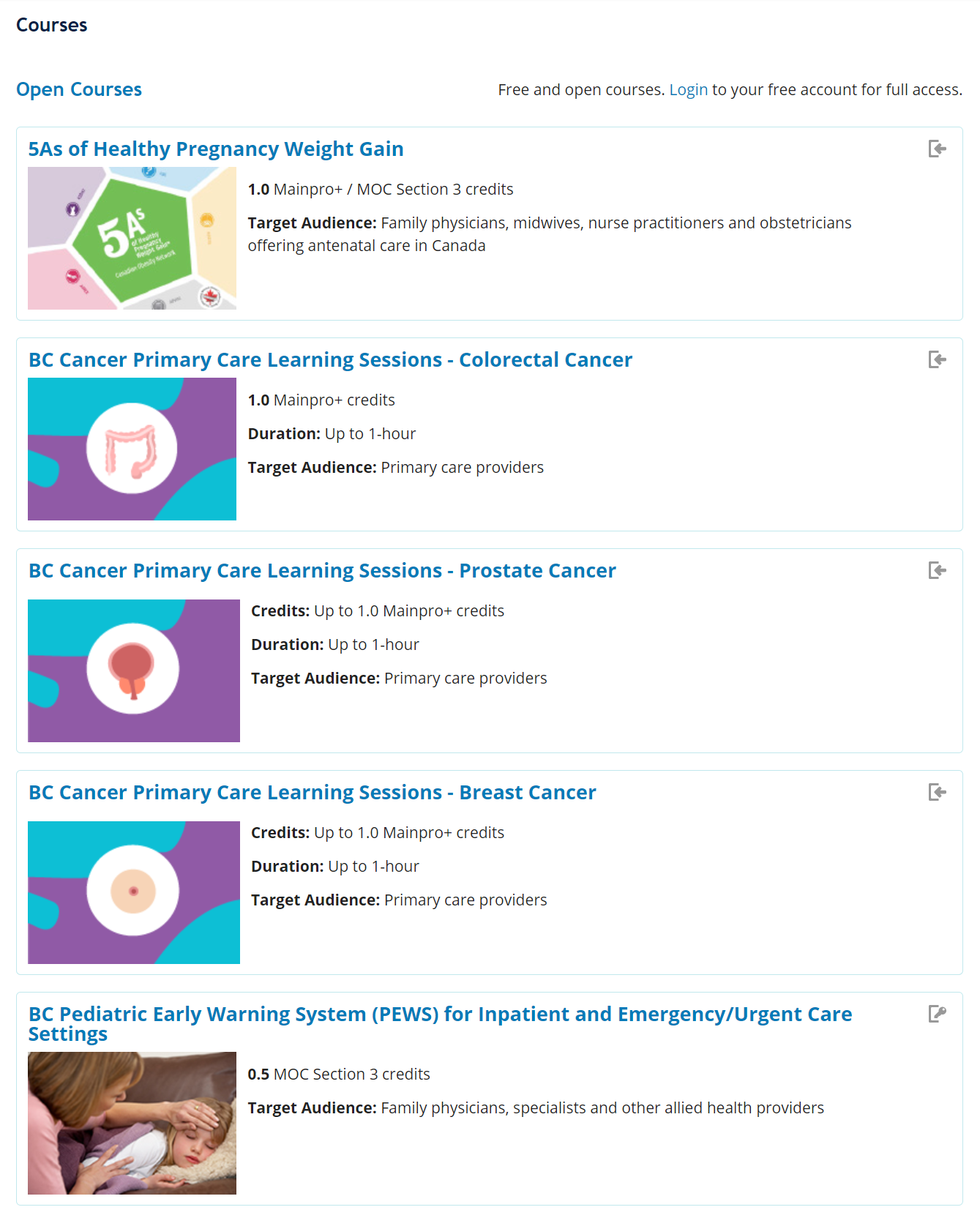
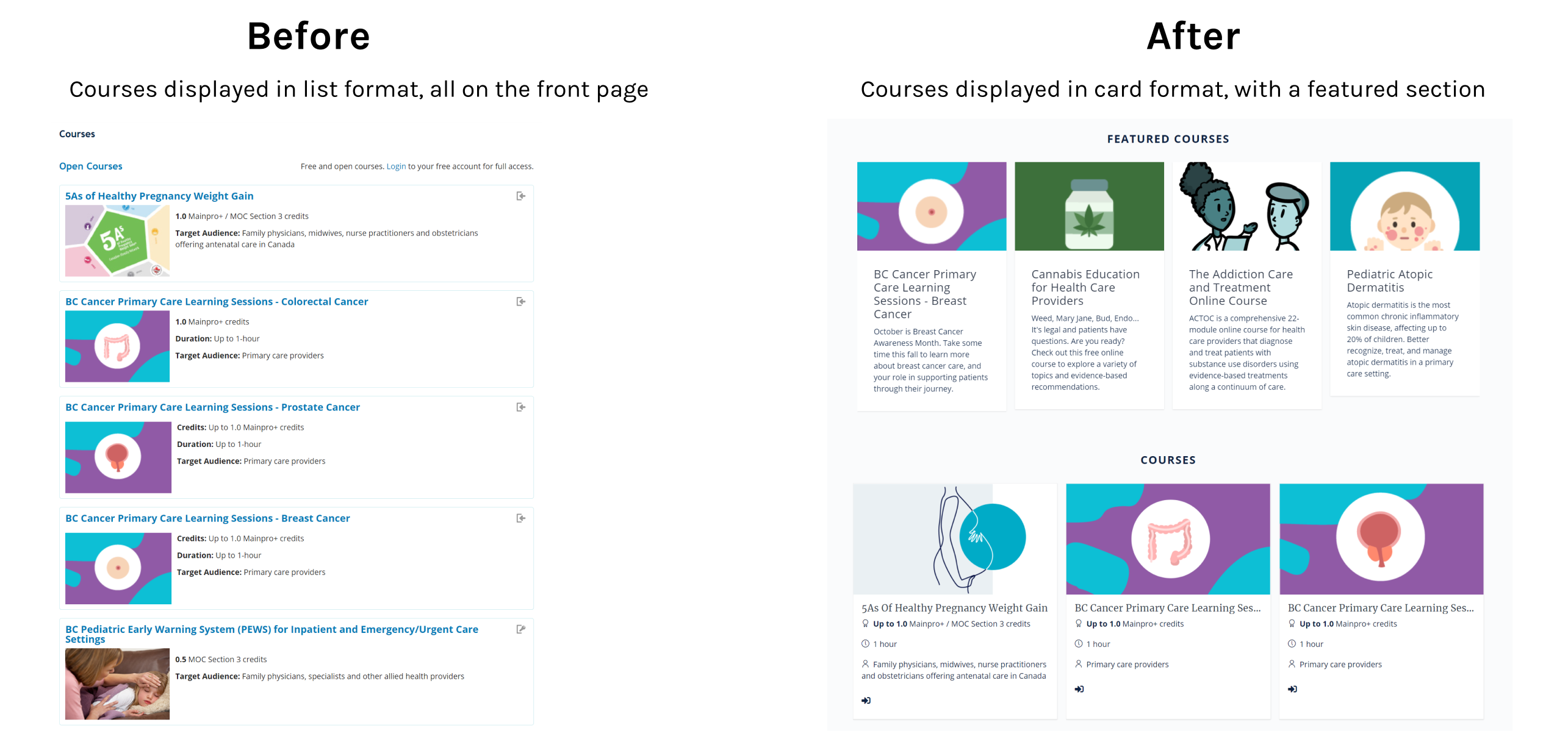
All of our courses and conference materials were displayed on the front page. This resulted in our front page becoming too long, overwhelming, and difficult to browse.
Our site's UI elements were cluttered, and the course pages displayed many links that were not relevant to the learner's needs. This resulted in our learners having difficulties finding the pages that they were looking for.
"It's a bit hard to navigate when going back to previous slides. I wanted to look up an abbreviation and it was too bothersome to actually find the slide with the abbreviations."
- Quote from a learner
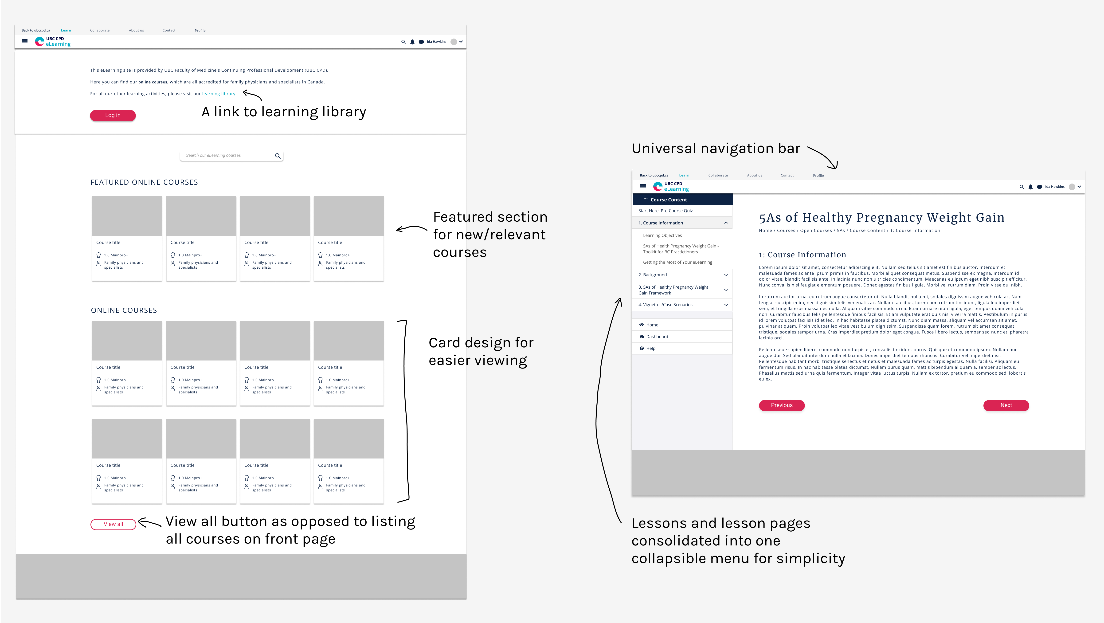
Another big issue with the eLearning site was that there was no clear way to navigate back to our main learning library. Ideally, we would like our learners to view our full list of learning resources on our main site, instead of viewing only the eLearning content on our subsite. This way, our would be able to view the full range of our available content/services.
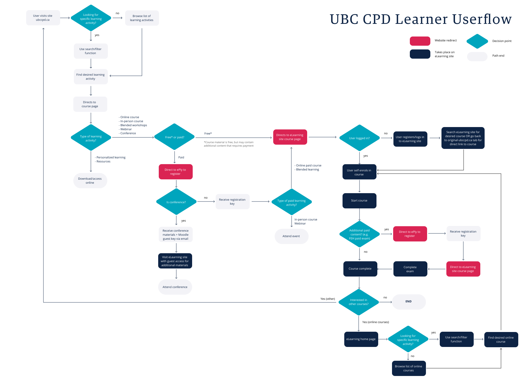
In order to better visualize our learner's journey through our department's websites, I created a userflow. This allowed me to make sure that all the points of possible website redirection are accounted for.
After studying the userflow, I proposed:
1. Utilizing an universal navigation system to better link the websites together, and
2. Ensuring that a link back to the main site's learning library is available whenever our learner wishes to browse our learning content.
With our user pains in mind, I began to draft up some screen mockups.
As I briefly mentioned earlier, the unflexible nature of our LMS and the lack of available developers was a major constraint for us. So with my mockup in mind, I searched for a pre-built theme that would appear as close possible to my mockup. After implementing the theme, I went in and edited the CSS styling to match our branding style.
The overall UI styling of the website follows the new branding guidelines that were determined by our creative agency. The key elements of the new branding style involve a light and airy feel, continuous line illustrations, and compositions with plenty of white space.
When we ran contrast checking tests on the site for accessibility, we noticed that the teal text on white did not provide enough contrast. This was addressed by ensuring that key text information is highlighted using raspberry instead of teal. We have also darkened the teal colour of our text slightly, to ensure that we meet WCAG's minimum AA contrast ratio of 4.5.
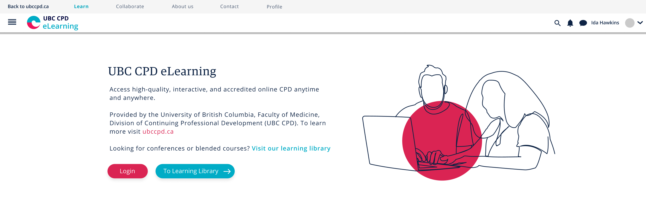
Although our creative agency had originally provided some illustrations for us, I felt that it was important for our eLearning site to have our own custom illustration. I created this vector line drawing in Illustrator for our home page header.

At this stage, we wanted to test if the new design had indeed helped solve any of the original user pains, and if there are any new user pains associated with the new design. I facilitated a couple user testing sessions, and jotted down the feedback.
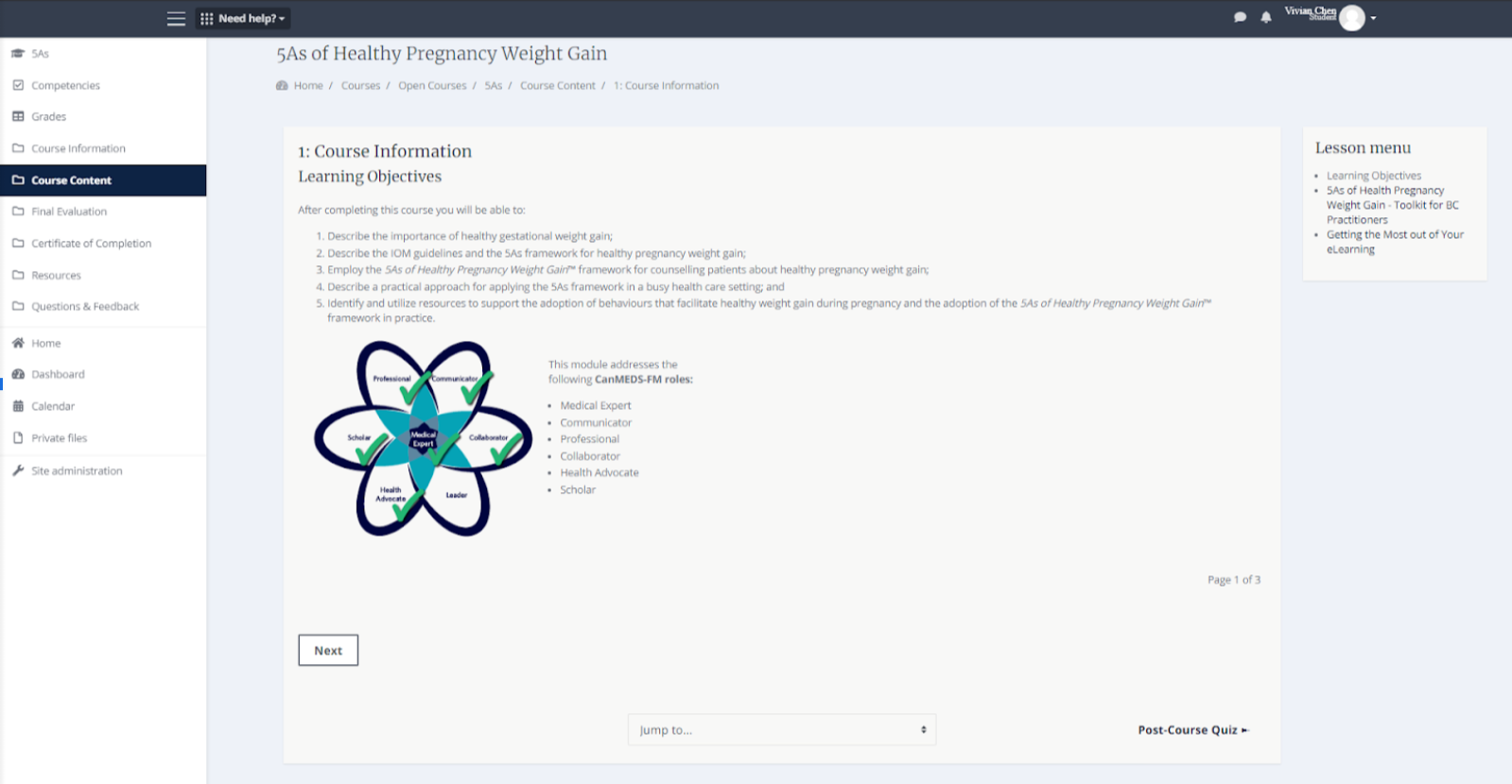
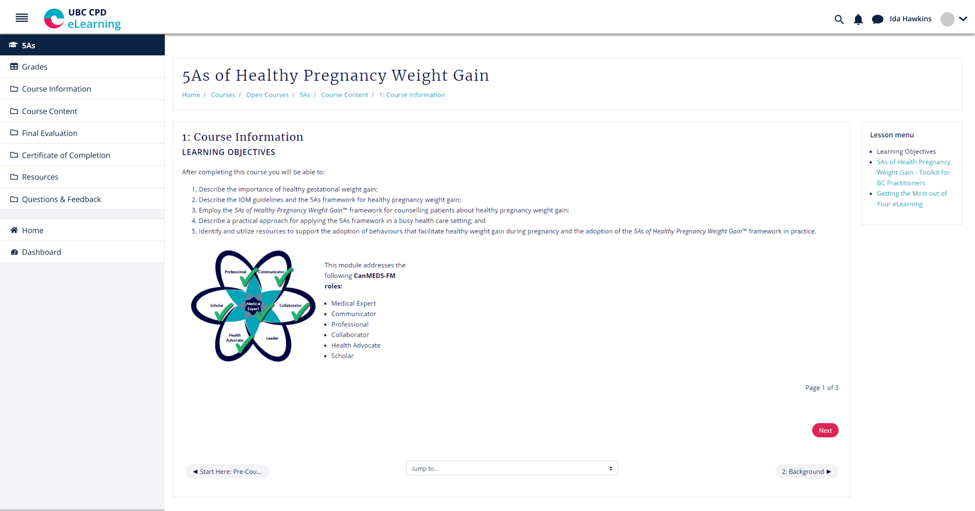
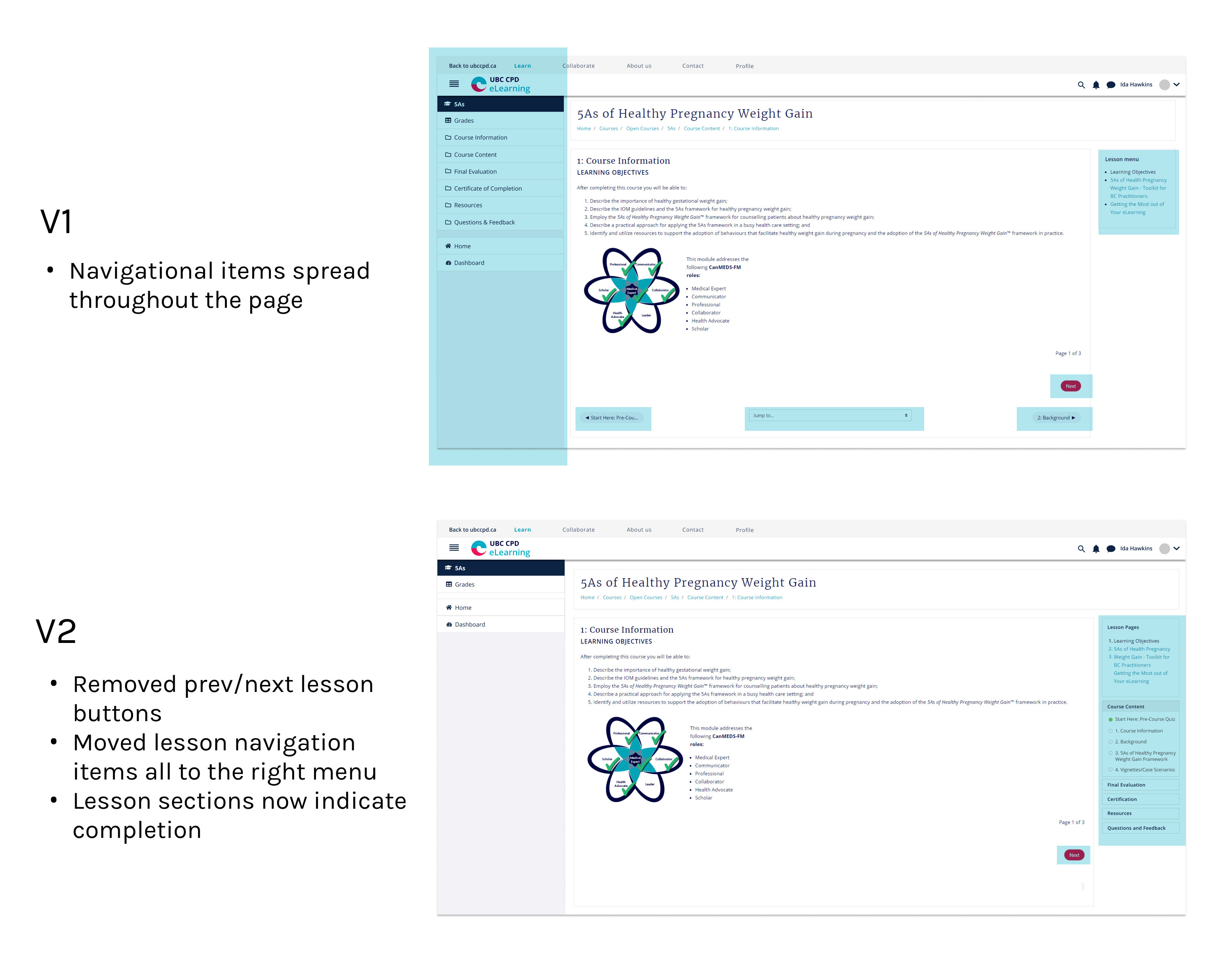
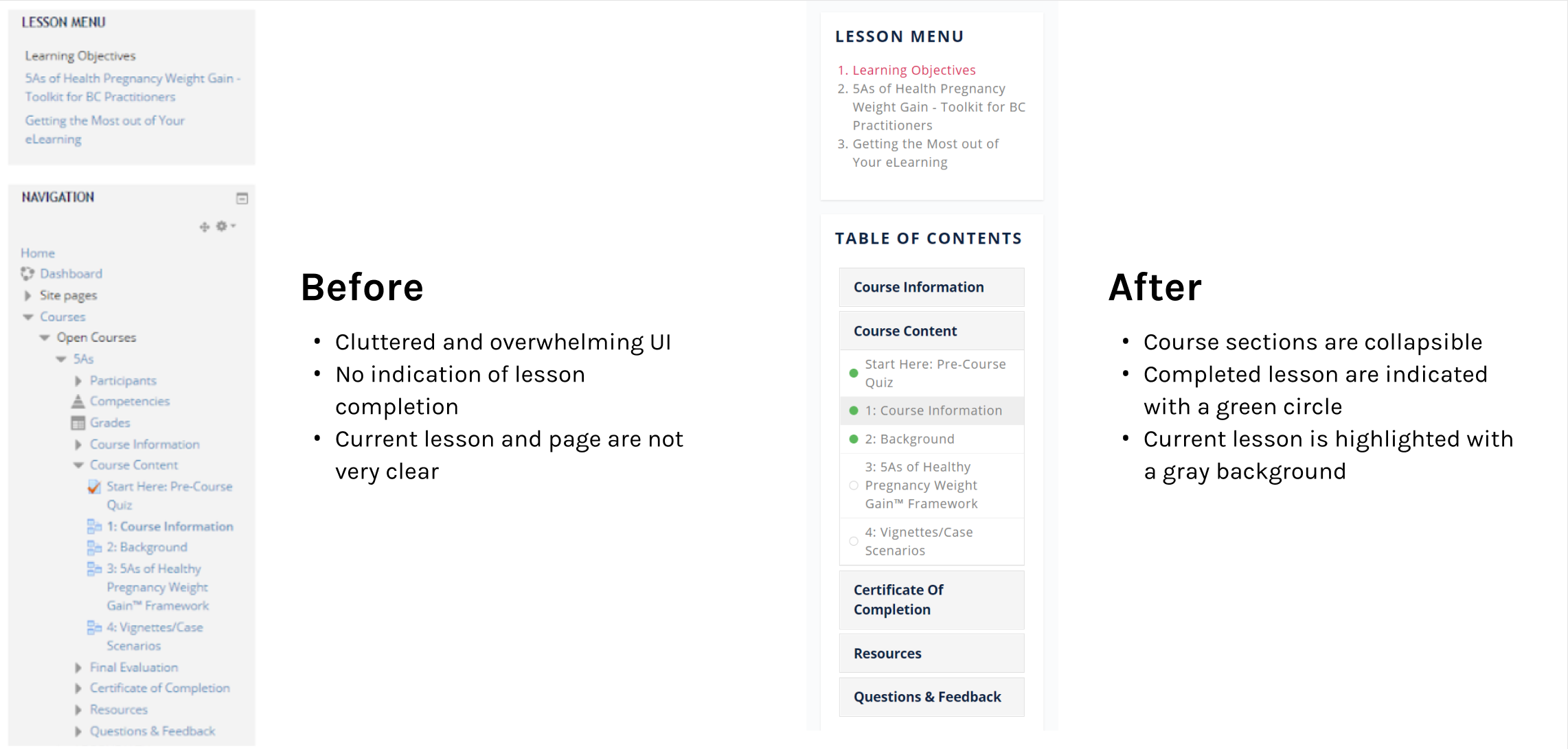
The primary criticism of the new theme was that having too many scattered navigational links was messy and confusing. By default, the newly updated LMS had separated the page navigation menu and the lesson module navigation menu onto two different sides of the screen. There was also a "jump to" navigation bar at the bottom of each lesson page, as well as buttons to go to the previous and next lesson.
From my user testing sessions, I found that some users would click on the "next lesson" button instead of the "next page" button, and get lost within the course. Some users felt that all the different ways of navigating through the course was unnecessary and distracting.
To remedy this, I found a plugin that would allow me to consolidate the lesson navigation items into a single collapsible menu. The lesson items would also indicate completion with a filled in green circle.
The redesigned site features a clean user interface with a focus on white space, to allow for the learning material to be the main focus on the page.
For the courses displayed on the front-page, we switched to a card format as opposed to a list format for a faster browsing experience.
We limited the number of courses displayed on the front page and added a button for users to click on, to view all the courses. The user would then be able to select the course category that they are interested in.
We have also implemented a featured courses section at the top of the page, so that we are able to feature any new and relevant courses.
In-course navigation was simplified so that learners only see the links pertaining to their lesson, without the old visual clutter.
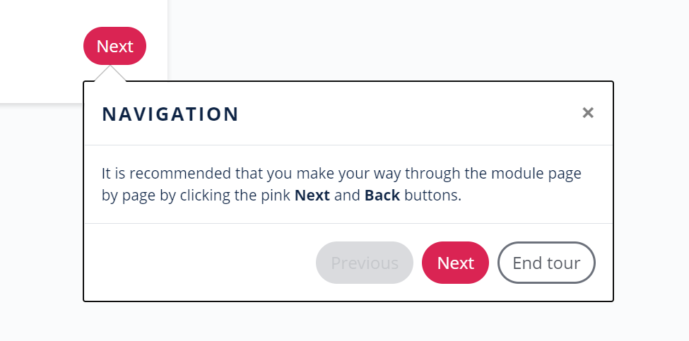
In addition to the redesigned navigation panel, we have also implemented a user tour system, to walk learners through key user interface elements.
To link our eLearning site back to the main site, we will be implementing a universal navigation bar at the top of the eLearning site. This will allow learners to easily return to the main site at any time, and also tie the two websites together.
From the user testing, we found that many users missed the anchor tag link in the text, so we will be adding a call-to-action button to the Learning Library on the main site.
"Greatly enjoyed the layout. The site was very easy to follow, with the flow of the content, courses, and resources."
- Quote from a learner
After the redesign of our eLearning site was implemented, we have received a significant reduction in emails regarding navigational usability issues on our site.
Going forward, our team will continue to monitor user feedback, and think about ways to improve our learner's experiences, even challenging our existing design systems if needed.
← Previous Project
QxMD Read
Next Project →
Animal Crossing