
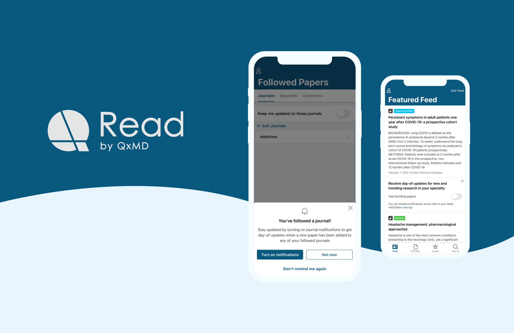
QxMD Read is a web and mobile (iOS, Android) app that helps busy physicians stay on top of the latest medical literature, and makes it easier for them to find papers relevant to their practice.
With the app, users can choose their field of specialty and start following medical journals, keywords, and curated collections that align with their interests. By doing so, physicians can stay up to date with the most recent and relevant research without having to sift through extensive volumes of medical journals.
Feb 2023 - Current
My role:
Sole designer - discovery, research, design, artifacts, testing
Team:
Michael Crumsho, VP of Product
Chan Kruse, VP of Engineering
Joe Dickson, Copywriter
Vivian Chen, Product Designer
Our team observed low opt-in rates for push notifications in the mobile app. Additionally, we noticed that push notification open rates were significantly lower than the send rates. To improve engagement, we decided to investigate this issue further and find ways to enhance user interaction with push notifications.
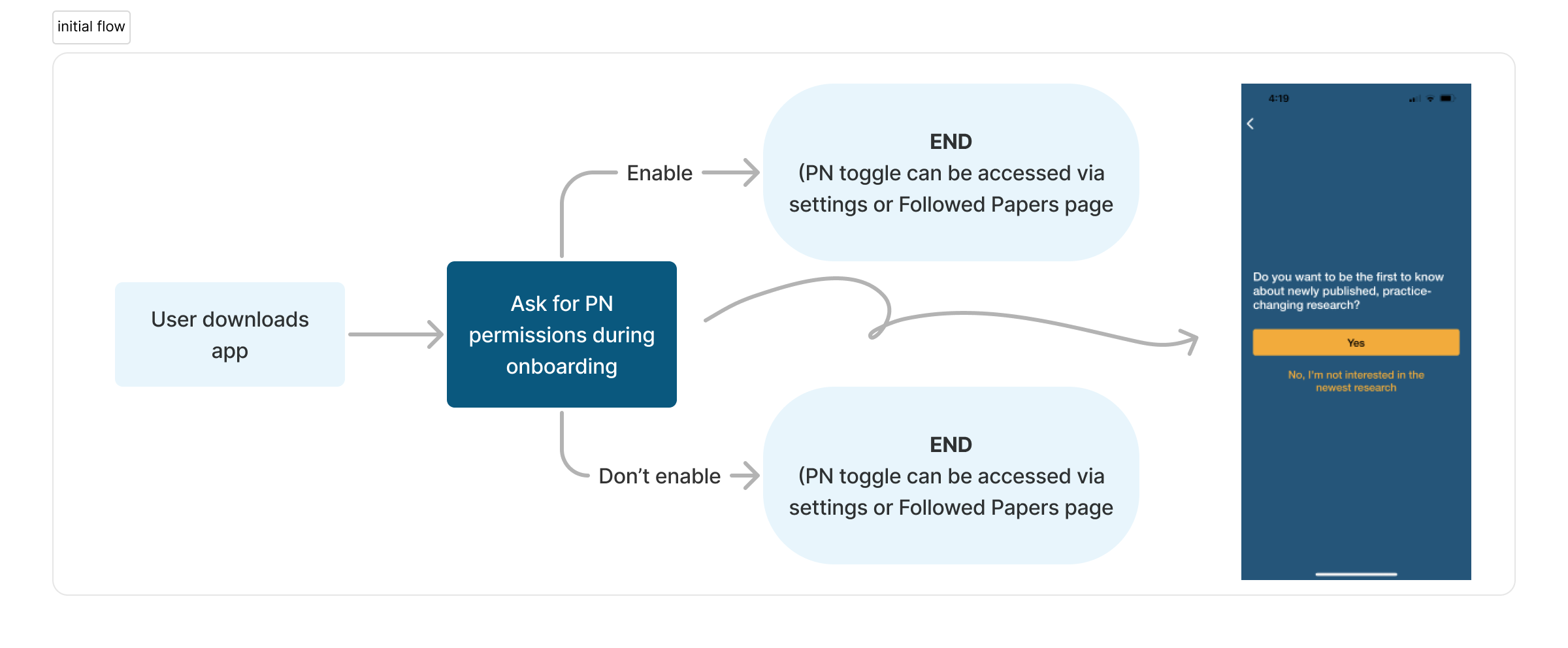
I started this project by taking a look at the current flow in our app. In the existing flow, we ask users to enable push notifications right after they sign up for our app, during onboarding.
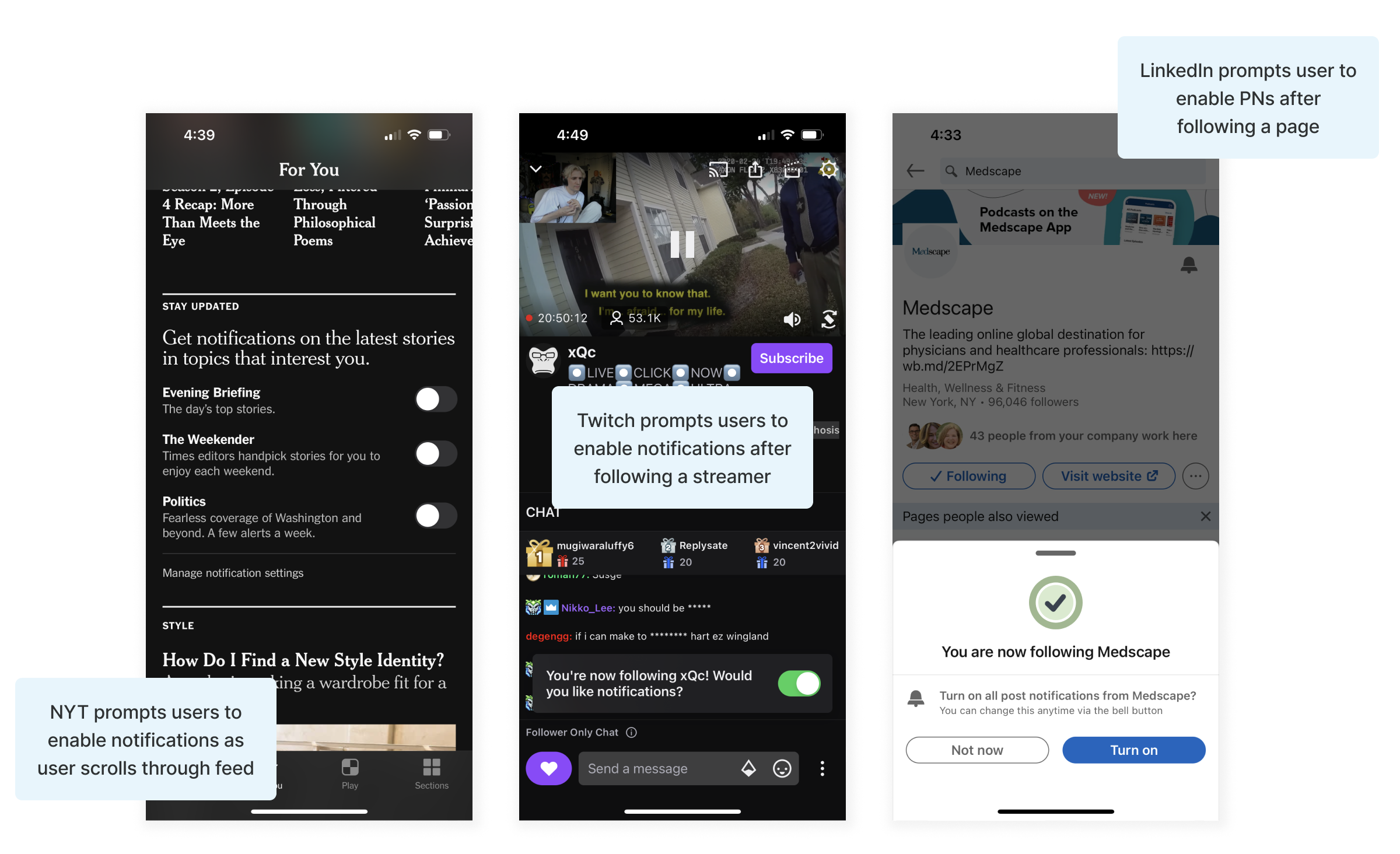
I dedicated time to conduct online research and perform a competitive analysis to explore how other popular apps encourage users to enable push notifications. From this research, I uncovered several best practices for requesting users to enable push notifications:
The next step involved gathering direct feedback from our QxMD Read users. To gain insights and identify potential areas for improvement in both push and email notifications, I conducted 5 user interviews with health care professionals (HCPs) ranging from a first year med student, to an emergency physician with 49 years of experience.
I discovered key findings for improving push and email notifications:
"I'm not interested in the number of new papers available, I'm just interested in the topics."
I conducted an unmoderated user test with 10 physicians using a clickable mobile prototype from usertesting.com. The test aimed to:
Key Insights:
“I saw the journal that I wanted, so I'm OK and more comfortable with the notifications in particular to the journal.”
“If I’m getting notifications multiple times a day, there’s no way I would sign up”
“I think it’s great to ask once, or one time after. But repeatedly asking is going to increasingly discourage me to press them at that point.”
To improve opt-in rates and user satisfaction, we'll consider these insights while refining our push notification strategy.
Research findings in mind, I came up with several recommendations to enhance the existing flow and wireframes:
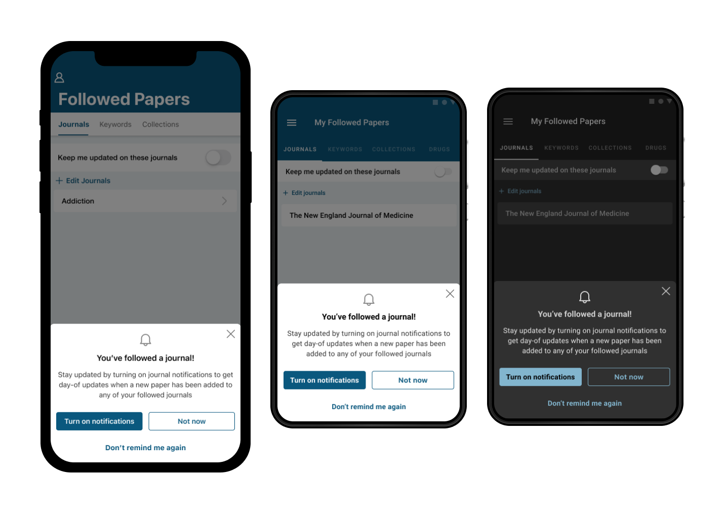
Onboarding Prompt: We'll use in-feed prompt, not during onboarding, to align with best practices. Users can familiarize themselves with the app's value before deciding on push notifications.
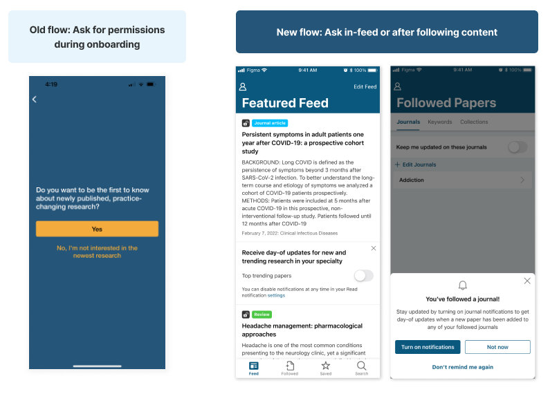
Hide Reminder Option: We'll add a hide option in-feed to address user annoyance with constant reminders, empowering them to manage their preferences.
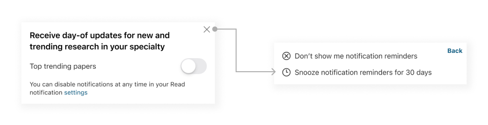
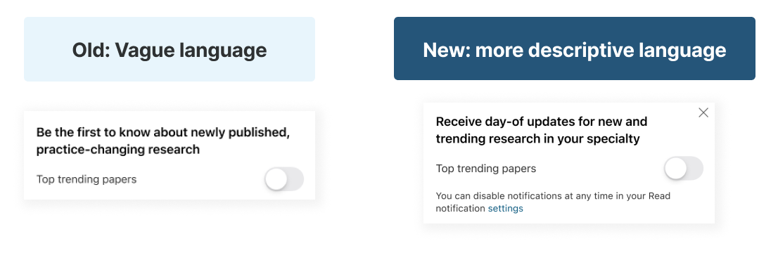
Improved Wording for Notification Toggle Prompt: Revamped language for more clarity and specificity. Users will know the type of content they'll receive and their notification management options
Adjustable Notification Frequency: Exploring two options - set notifications per week, gradually increasing this for engaged users, or let users choose their preferred frequency for more control. This idea is tabled for later, due to lack of backend developer resources.
I am currently in the process of collaborating with the dev team to implement design updates and address potential edge cases. I'll closely monitor push notification opt-in rates post-implementation to gauge the impact and improve user engagement and satisfaction.
By actively working with the dev team and continuously measuring the opt-in rates, we can effectively gauge the success of the design changes and make any necessary adjustments to further enhance user engagement and satisfaction.
← Previous Project
Medscape Education
Next Project →
UBC CPD